Design in Audio AI: Do we really need it?
Hello! I'm Anne, a designer at Gaudio Lab :)
GAUDIO STUDIO has been revamped.
We recently launched a new look for our online AI stem splitting serivce, Gaudio Studio.
Gaudio Studio is a service that separates vocals and instruments (bass, drums, electric guitar, piano, etc.) into individual tracks from the music you want. It is equipped with GSEP, a music separation technology developed by Gaudio Lab, and shows excellent performance compared to other music separation services.
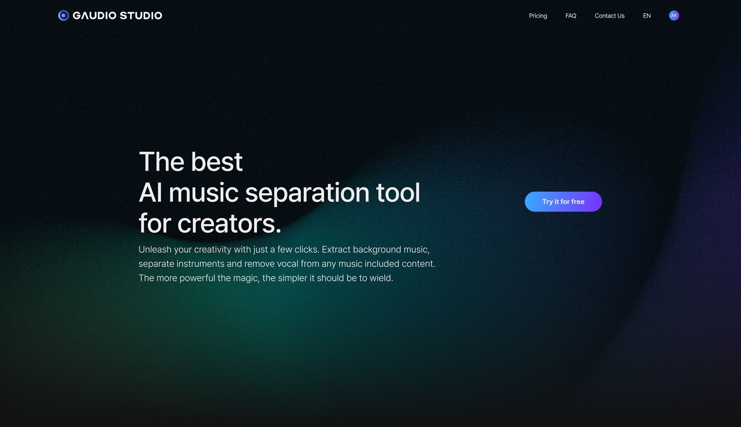
I was responsible for the UIUX redesign of Gaudio Studio, a project to improve the beta version and launch it as a public service. In this post, I will talk about "the considerations an audio AI company designer had" in launching the improved service.
Is design important for an audio AI company?
When I first joined Gaudio Lab, I thought, 'This is an audio AI company, so the culture will be more focused on technical roles than design.' But as time went by, my preconceptions disappeared. Instead, I realized that design is important because we're an audio AI company.
-
This is because we need to visualize the invisible "sound"
-
and we need to make AI services, which may be unfamiliar to the general public, easy to use for everyone.
Design Goals for the NEW Gaudio Studio
Our goal for the UIUX of the new Gaudio Studio was to "provide a friendly design so that users don't get lost in the music separation process".
Have you ever been amazed by a website at first glance but found yourself confused when trying to use it? Asking questions like, 'Where is the menu? What do I click next? Where does this button take me?' repeatedly.
I thought that since Gaudio Studio is a place where users come not just to find information but to use the service, the design should serve as a good guide. So that users can take their next action without hesitation or questions as soon as they enter.
It's an AI service. Does design even matter?
This is the question a friend asked me while watching me struggle to achieve the above goal. Without hesitation, I shouted "Yes, it matters!" but I couldn't explain exactly why, because in the back of my mind, I thought that maybe all users want is cheap and good technology.
Every time the thought crossed my mind, I kept recalling what I wanted to achieve after the service launch.
What I wanted was,
-
To make our service more appealing to users who have been using other sites for separating music,
-
to give existing users of the beta version of Gaudio Studio an upgraded experience,
-
and I wanted to provide a design that new users could easily adapt to without difficulty.
When designers lose their edge, product owners (POs) lose their hair
Unfortunately, I didn't achieve what I wanted from the beginning. After the service launch, I received feedback that the music separation process was confusing. It's embarrassing, but I'll share my trial and error.
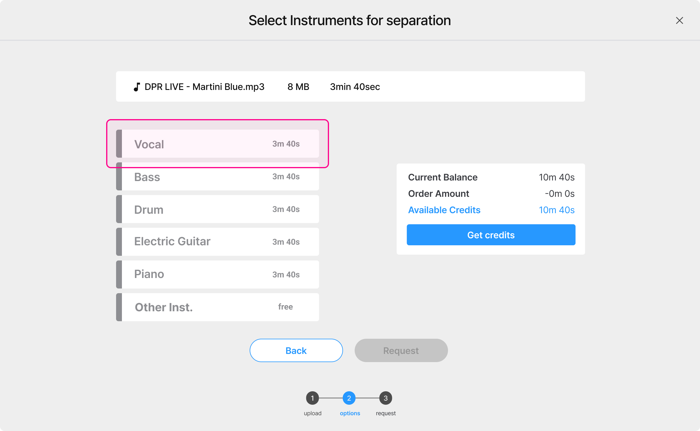
This is the screen I initially designed. The user uploads a song and selects the instruments they want to separate.
If you press the vocal button on this screen with nothing selected,
the music is separated into two tracks: one with vocals and one without vocals.
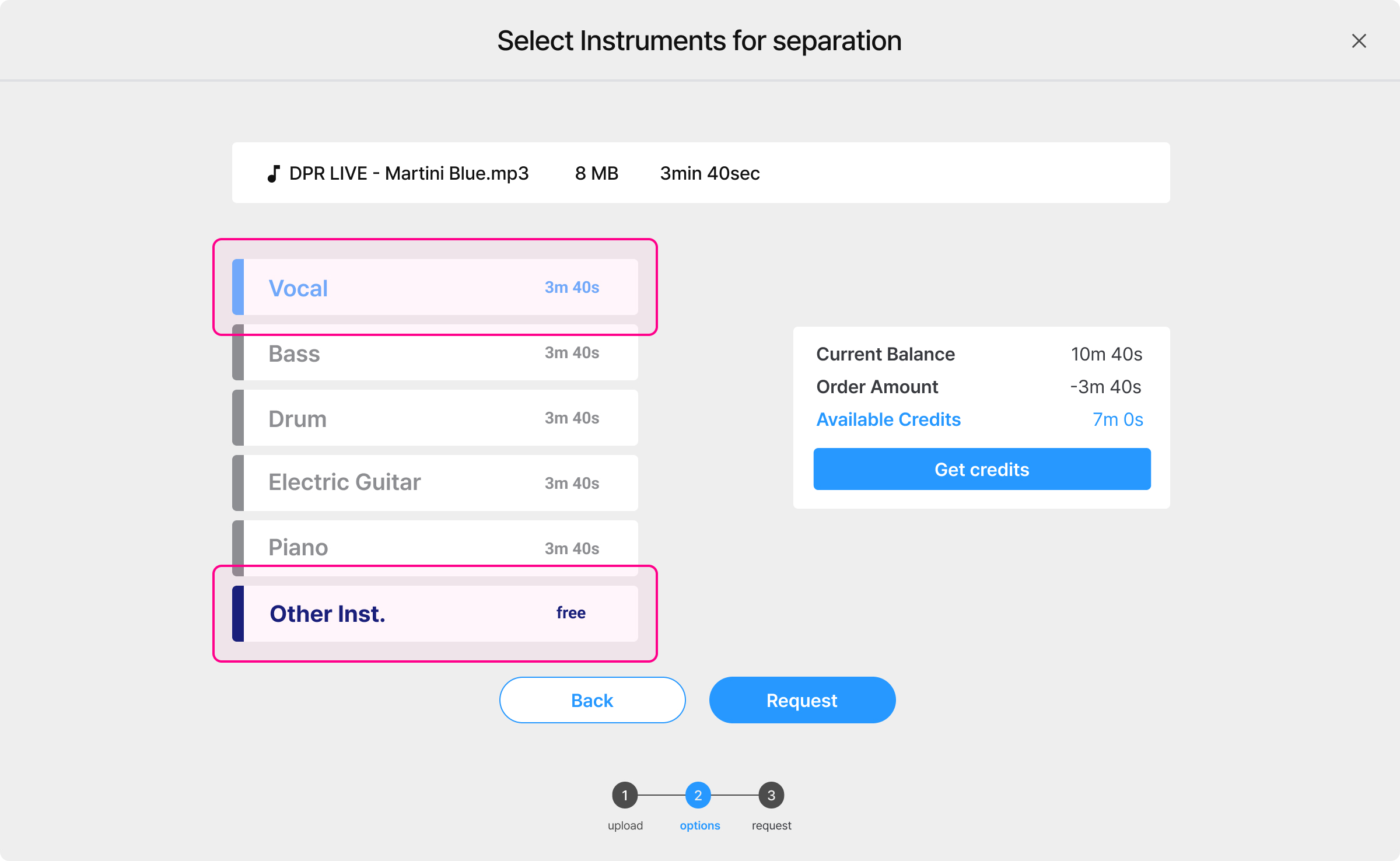
I lost sight of my initial goal of aiming for 'easier, more convenient' and tried to create a clean screen by omitting various explanations. As a result, after the service launch, I received a lot of feedback saying, "I want to create an instrumental(backing track) file, but I don't know how."
When we looked at the data, many users selected all instruments instead of just the vocals because they thought they had to remove the vocals.
User frustration mounted, the PO's hair was falling out, and my guilt was building... We had an emergency meeting and decided to revamp the design, and here are the new screens.
Easier, more convenient!
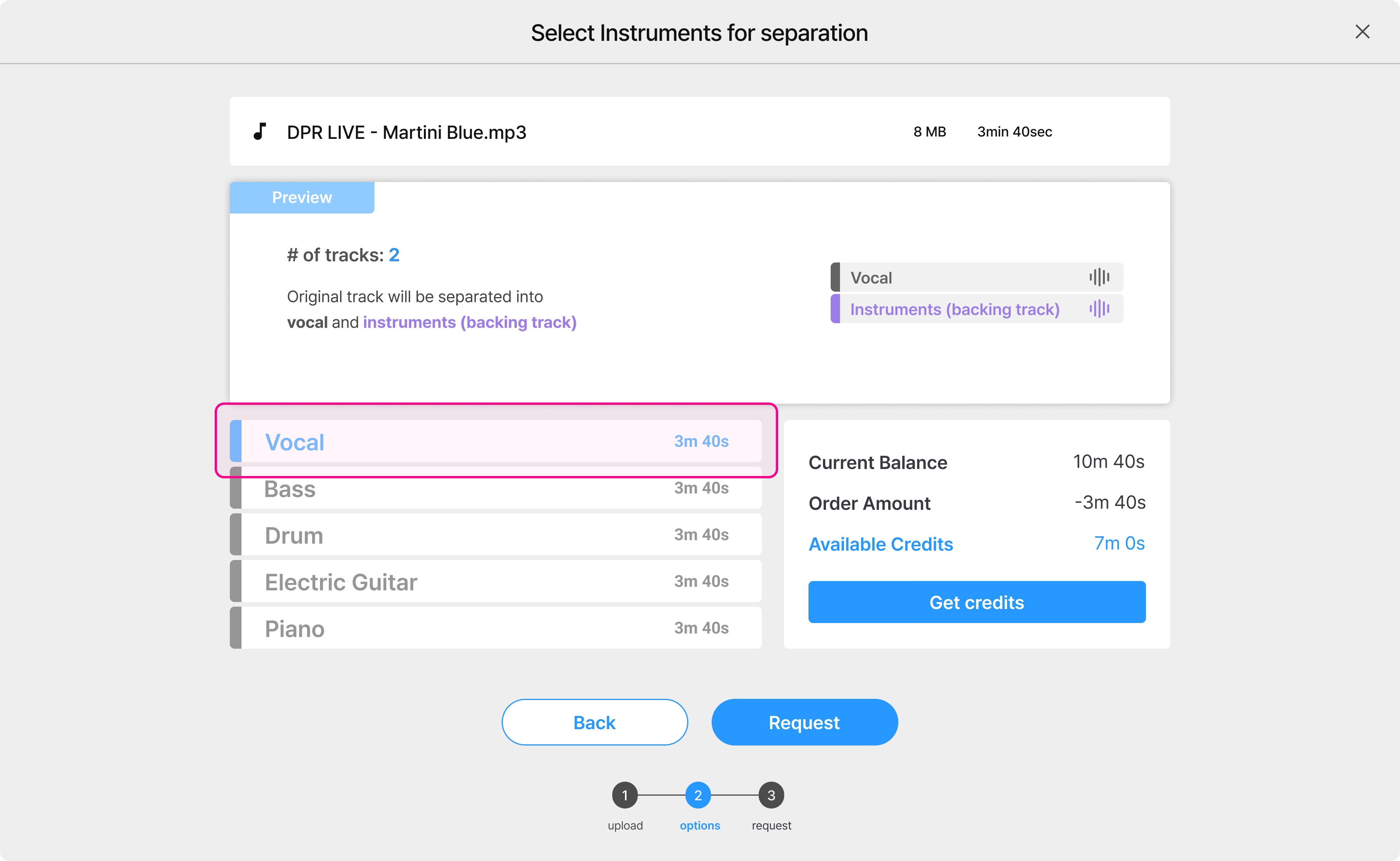
The biggest change is the addition of a preview screen.
From the moment nothing is selected, it shows the number of tracks that will be separated and provides a guide.
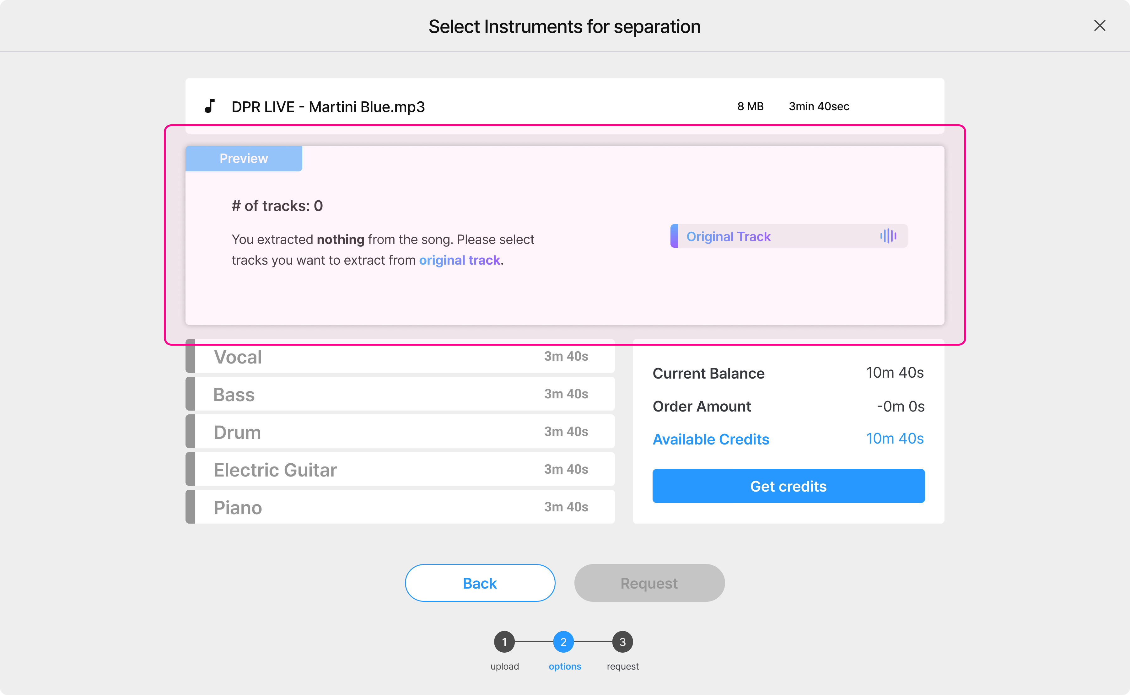
When the vocal button is pressed, it shows in advance that two tracks will be provided, indicating that the vocal and instruments (backing track) will be provided. This clearly shows the results that the user will get before they purchase credits or request music separation.
We're an audio AI company, so design matters
After improving the instrument selection screen, I first showed the changed screen to my friend who asked, "Does design even matter?" This friend also stabbed my heart by asking, "How do you use this?" when we first opened, but fortunately, she said it was much easier to understand after seeing the improved design.
At this point, I think it's safe to say that design matters because it's an audio AI company. Right?
(Please say yes...)
In conclusion...
At the time of writing this post, the improved instrument separation screen is not yet live.
I'm sure you're curious to see how real users react to it - I know I am!
If I get the chance, I'll come back with reviews and more design stories unique to Gaudio Lab.
This concludes the design story of an audio AI company told by Anne, a designer at Gaudio Lab.
Oh! Please use our service, https://studio.gaudiolab.io/ a lot :)


